
Have you ever unlocked your smartphone with one simple goal?
Maybe we wanted to check the weather.
Or perhaps we just wanted to set an alarm.
But within seconds, we found ourself opening Instagram, WhatsApp, Gmail, or LinkedIn instead.
What changed your mind?
The answer wasn’t a loud sound.
It wasn’t a popup message.
It wasn’t even another person.
It was simply a tiny red notification badge.
A small red circle with the number “1” or “5” sitting quietly on an app icon somehow managed to steal your attention.
It looks harmless.
Yet billions of people across the world respond to it every single day.
Even when we’re busy.
Even when we’re driving.
Even during meetings.
Even before going to sleep.
That tiny red dot has become one of the most powerful attention-grabbing tools ever designed.
But have you ever wondered why almost every major app uses red?
Why not blue?
Why not green?
Why not yellow?
Surely, if the purpose is only to tell us that something is new, any color should work.
Surprisingly, that’s not true.
Behind that tiny red badge lies decades of research in marketing psychology, neuroscience, behavioral economics, color psychology, and user experience (UX) design.
Companies like Apple, Google, Meta, Microsoft, LinkedIn, and countless others don’t choose red by accident.
Every color, every shape, and every number is carefully designed to influence one thing.
Your attention.
And once they have your attention, they have the opportunity to earn your time.
In today’s digital world, attention is one of the most valuable currencies.
Companies no longer compete only for your money.
They compete for your focus.
The more time we spend inside an app, the more advertisements we see, the more content you consume, and the more valuable you become to the platform.
That tiny red notification badge is one of the smallest design elements ever created.
Yet it quietly influences millions of decisions every minute.
Table of Contents
- What Is a Notification Badge?
- Notifications Are More Than Just Reminders
- Why Do Most Apps Use Red Notification Badges?
- The Psychology of Color: Why Red Captures Our Attention
- Why Our Brain Notices Red Before We Realize It
- The Secret Behind the Tiny Red Dot
- The Zeigarnik Effect: Why We Can’t Ignore Unread Notifications
- Why Red Works Better Than Blue or Green
- How Popular Apps Use Notification Psychology
- The Hidden Marketing Strategy Behind Notification Badges
- The Attention Economy
- Marketing Lessons Businesses Can Learn
- Frequently Asked Questions (FAQs)
- Final Thoughts
What Is a Notification Badge?
A notification badge is a small colored circle that appears on an application’s icon whenever there is new activity waiting for the user.
It usually displays a number representing unread notifications.
For example:
- 1 unread WhatsApp message
- 8 unread Gmail emails
- 15 Instagram notifications
- 3 LinkedIn connection requests
At first glance, a notification badge looks like a simple reminder.
However, from a business perspective, it serves a much larger purpose.
Every app competes with dozens—or even hundreds—of other apps installed on your smartphone.
Think about your own phone.
You probably have more than 50 applications installed.
Yet you actively use only a small percentage of them every day.
Why?
Because certain apps constantly remind you that something is waiting.
Instead of saying,
“Please open me.”
They quietly whisper,
“Something happened while you were away.”
That single sentence is enough to spark curiosity.
And curiosity is often enough to make us tap the icon.
The badge doesn’t force us to act.
It simply encourages us to satisfy our curiosity.
That subtle difference makes notification badges one of the most effective engagement tools in modern technology.
Notifications Are More Than Just Reminders
Most people believe notifications exist only to provide useful information.
That’s only part of the story.
From a business perspective, notifications are one of the most powerful customer retention tools ever created.
Imagine owning a coffee shop.
A customer visits once.
If they never return, your business struggles.
The same principle applies to mobile applications.
Getting someone to download your app is only the beginning.
The real challenge is bringing them back again and again.
That’s exactly what notification badges are designed to do.
Every unread message…
Every new comment…
Every like…
Every order update…
Every delivery notification…
Every connection request…
Every reminder…
These are opportunities to reconnect with the user.
Instead of interrupting users with advertisements, notification badges quietly create curiosity.
They bridge the gap between the user’s real world and the digital world.
Without making a sound, they invite us back into the app.
Why Do Most Apps Use Red Notification Badges?
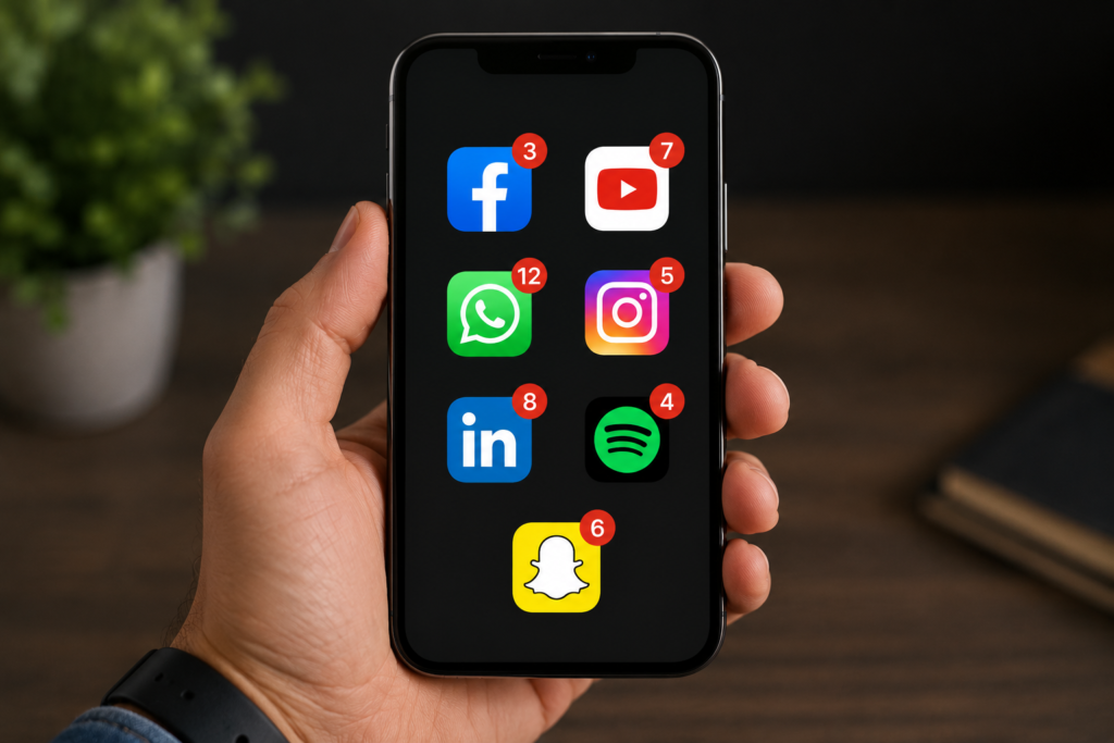
ake a close look at the apps on your smartphone.
Facebook uses blue.
WhatsApp uses green.
LinkedIn uses blue.
Spotify uses green.
Instagram has a colorful gradient.
Every brand invests heavily in choosing colors that represent its identity.
Yet when it comes to notification badges, almost every company suddenly switches to bright red.
Why?
The answer is surprisingly simple.
Contrast.
Imagine walking through a dense green forest.
Everywhere you look, you see green trees, green leaves, and green grass.
Now imagine spotting a bright red apple hanging from one branch.
Which object catches your attention first?
Almost everyone notices the apple.
Not because it’s larger.
Not because it’s moving.
Simply because it stands out.
Psychologists call this Visual Salience.
Objects that differ from their surroundings naturally attract our attention faster than objects that blend into the background.
Notification badges use exactly the same principle.
Most app icons appear calm and predictable.
Then suddenly…
A bright red circle appears.
Your brain notices it almost instantly.
Long before you consciously decide where to look.
This isn’t an accident.
It’s psychology.
The Psychology of Color: Why Red Captures Our Attention
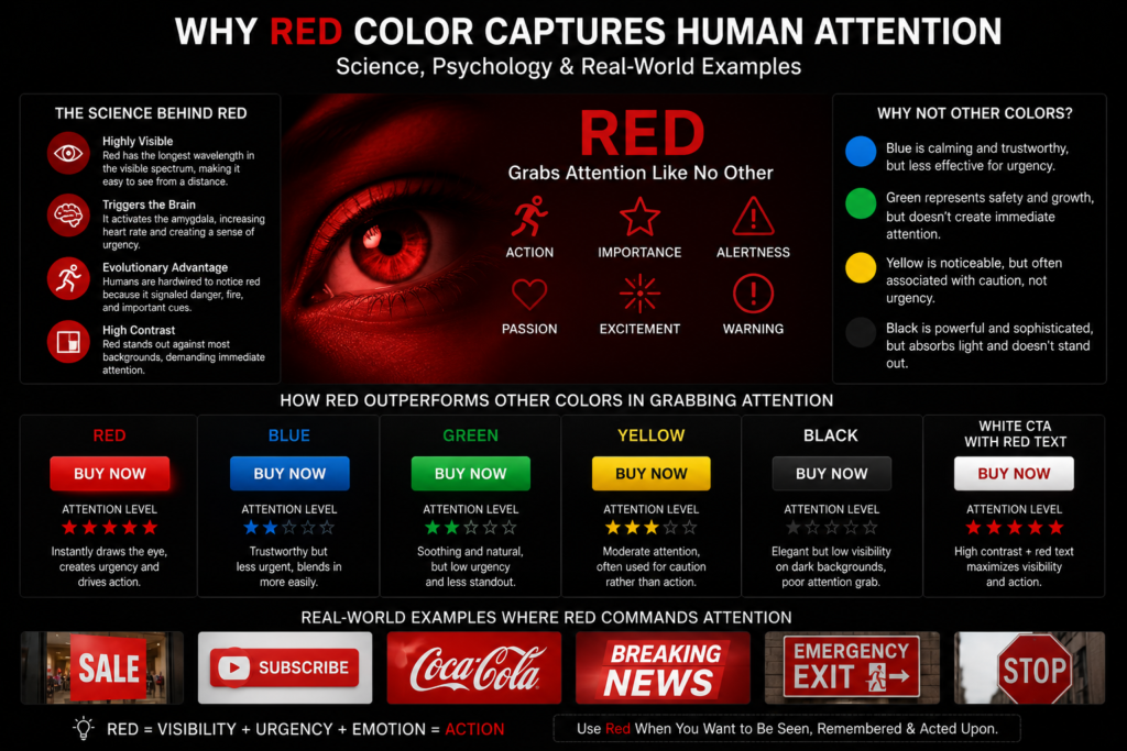
Colors influence our emotions long before we begin reading words.
Imagine walking into a hospital.
The walls are white.
Doctors wear white coats.
Everything feels clean, calm, and reassuring.
Now imagine if hospitals were painted black and bright red.
The emotional experience would immediately feel different.
This happens because colors communicate emotions silently.
Marketers have understood this for decades.
Businesses spend millions choosing brand colors because they influence how customers think and feel.
For example:
Blue is often associated with:
- Trust
- Stability
- Security
- Professionalism
That’s why many banks and technology companies use blue.
Green usually represents:
- Nature
- Growth
- Health
- Safety
This makes it popular among wellness brands and environmentally focused companies.
Yellow is linked with:
- Optimism
- Energy
- Warmth
It attracts attention but can become overwhelming when used excessively.
Black often symbolizes:
- Luxury
- Sophistication
- Elegance
- Power
Luxury brands frequently use black to create a premium image.
Then comes Red.
Unlike every other color, red immediately communicates urgency.
It naturally signals:
- Action
- Importance
- Alertness
- Passion
- Excitement
- Warning
Think about everyday life.
Where do you see red?
Traffic lights.
Fire alarms.
Emergency vehicles.
Sale banners.
Breaking news.
Warning signs.
Even teachers often use red ink to highlight mistakes.
Notice something interesting?
Red rarely means,
“Relax.”
Instead, it almost always means,
“Pay attention.”
That is exactly why notification badges are red.
They don’t simply inform you.
They persuade your brain that something deserves your immediate attention—even before you’ve decided whether it actually does.
Why Our Brain Notices Red Before We Realize It
Our attraction to the color red didn’t begin with smartphones.
It began thousands of years ago.
Long before humans built cities, invented technology, or created mobile applications, our ancestors depended on their ability to notice important signals in nature.
Back then, spotting certain colors quickly could mean the difference between survival and danger.
Red often indicated:
- Blood
- Fire
- Injury
- Dangerous animals
- Warning signs in nature
- Ripe fruits ready to eat
People who reacted faster to these signals had a greater chance of surviving.
Over thousands of generations, the human brain evolved to pay special attention to the color red.
Although modern notification badges have nothing to do with physical danger, our ancient survival instincts still respond in the same way.
Technology hasn’t changed human psychology.
Instead, it has learned how to use it.
Every time a bright red notification appears on your phone, your brain automatically treats it as something important.
You may not consciously notice it at first.
But your subconscious already has.
That is why the tiny red badge often catches your attention before you even realize you’re looking at it.
The Secret Behind the Tiny Red Dot
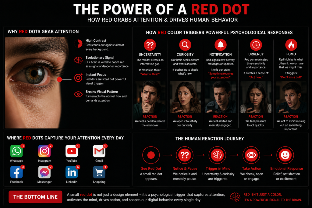
Many people assume notification badges work simply because they are red.
The truth is much more interesting.
Red is only the beginning.
The real power of notification badges comes from combining several psychological principles into one tiny design element.
Curiosity
Humans are naturally curious.
When we see a notification badge, our minds immediately begin asking questions.
- Who sent the message?
- Did someone reply to my comment?
- Is it an important email?
- Has my order been delivered?
- Did someone like my post?
The badge doesn’t provide the answer.
It simply creates a question.
And our brains naturally want to find the answer.
That curiosity is often enough to make us open the app.
Uncertainty
People dislike uncertainty.
Imagine seeing a notification that simply says:
1 New Notification
You don’t know whether it’s good news.
Bad news.
An urgent work message.
Or just a promotional email.
Until you open the app, your brain continues thinking about it.
Opening the notification removes that uncertainty.
This feeling encourages users to check their phones repeatedly throughout the day.
Urgency
Red creates a feeling that something needs attention now.
Even when the notification isn’t actually urgent, the color suggests importance.
Think about everyday life.
Traffic lights.
Fire alarms.
Emergency exits.
Warning signs.
All use red because our brains associate it with immediate action.
Notification badges use the same principle.
Fear of Missing Out (FOMO)
Imagine seeing your friends discussing something exciting online.
Or receiving a notification that someone mentioned you.
What if you don’t check it?
Could you miss an opportunity?
A conversation?
Important news?
This fear of missing out—commonly known as FOMO—encourages people to open apps more frequently.
The notification badge never says,
“You’re missing something important.”
Instead, it quietly suggests the possibility.
And sometimes, possibility is even more powerful than certainty.
The Zeigarnik Effect: Why We Can’t Ignore Unread Notifications
Have you ever watched a television series that ended on a cliffhanger?
Right before revealing the biggest secret…
The episode ends.
Suddenly, you feel an overwhelming desire to watch the next episode.
Why?
Because your brain dislikes unfinished stories.
Psychologists call this the Zeigarnik Effect.
Named after psychologist Bluma Zeigarnik, this principle explains that people remember unfinished tasks much better than completed ones.
Notification badges work in exactly the same way.
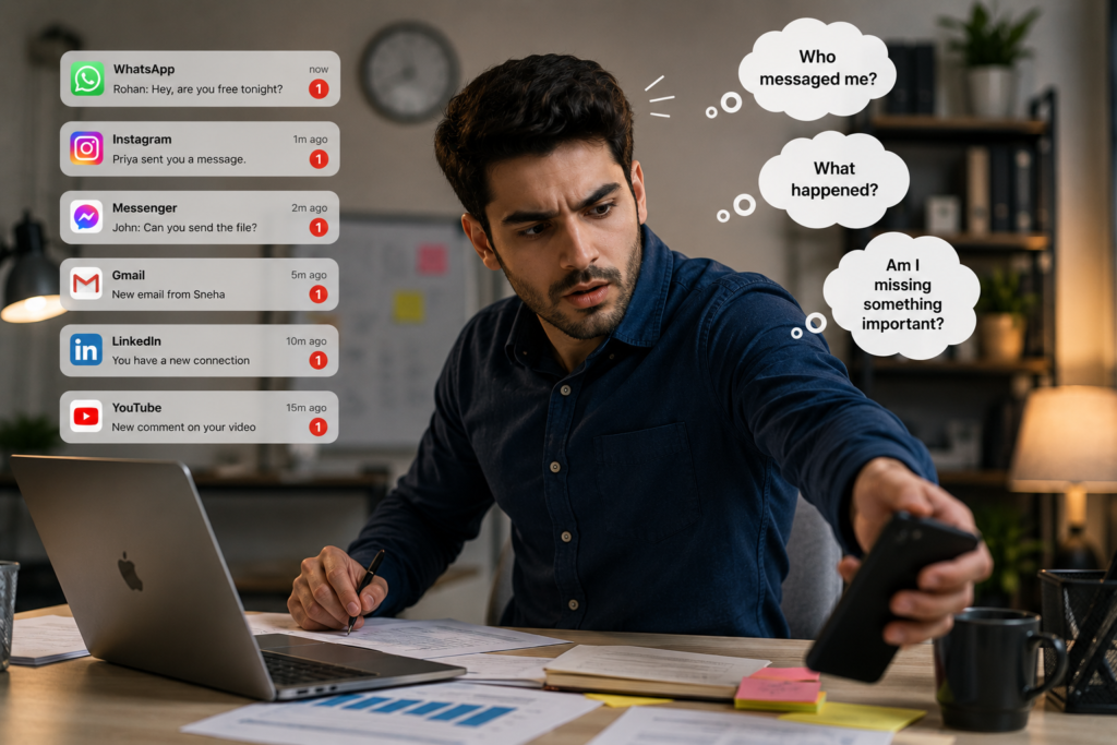
Every unread notification represents something incomplete.
Your brain begins asking questions.
- Who messaged me?
- What happened?
- Am I missing something?
- Is there something I should know?
Until you check the notification, your brain treats it like unfinished business.
That unfinished feeling creates mental tension.
The moment you open the notification, the tension disappears.
This explains why checking notifications often feels strangely satisfying.
Not because the message is always important.
But because your brain finally receives closure.
Why Red Works Better Than Blue or Green
If red is so effective, why don’t companies use other colors?
Let’s compare.
Blue
Blue represents:
- Trust
- Calmness
- Stability
- Professionalism
This makes blue perfect for branding.
Banks.
Technology companies.
Insurance companies.
Social media platforms.
However, blue rarely creates urgency.
A blue notification would simply blend into many app icons.
Instead of demanding attention, it would quietly fade into the background.
Green
Green represents:
- Safety
- Nature
- Growth
- Success
It’s ideal for brands promoting health or positivity.
But green also has a weakness.
Apps like WhatsApp already use green as their primary brand color.
If notification badges were also green, they would become much less noticeable.
Without strong contrast, users would overlook them more easily.
Why Red Wins
Red offers two major advantages.
First, it creates strong emotional importance.
Second, it creates strong visual contrast.
Those two factors work together to make notification badges almost impossible to ignore.
Even one small red circle immediately separates itself from everything around it.
That is why companies consistently choose red instead of other colors.
How Popular Apps Use Notification Psychology
Different apps use notification badges in different ways, but they all rely on the same psychological principles.

Imagine unlocking your phone and seeing:
WhatsApp (1)
Immediately, questions appear in your mind.
Who sent the message?
Is it family?
A friend?
Your manager?
An important customer?
The uncertainty creates curiosity.
Eventually, you open the app.
The notification has successfully achieved its purpose.
Gmail

Now imagine seeing:
23 Unread Emails
Many professionals feel uncomfortable leaving unread emails for long periods.
Each unread email represents unfinished work.
Even if most of the emails are unimportant, the notification creates mental pressure to clear them.
That is the Zeigarnik Effect in action.

LinkedIn notifications work differently.
Instead of entertainment, they often represent opportunity.
You might receive notifications such as:
- Someone viewed your profile.
- A recruiter searched for candidates.
- A new job matches your skills.
- A connection accepted your request.
These notifications trigger hope and ambition.
You begin wondering,
“Could this be an important career opportunity?”
Curiosity encourages you to open the app.
Amazon
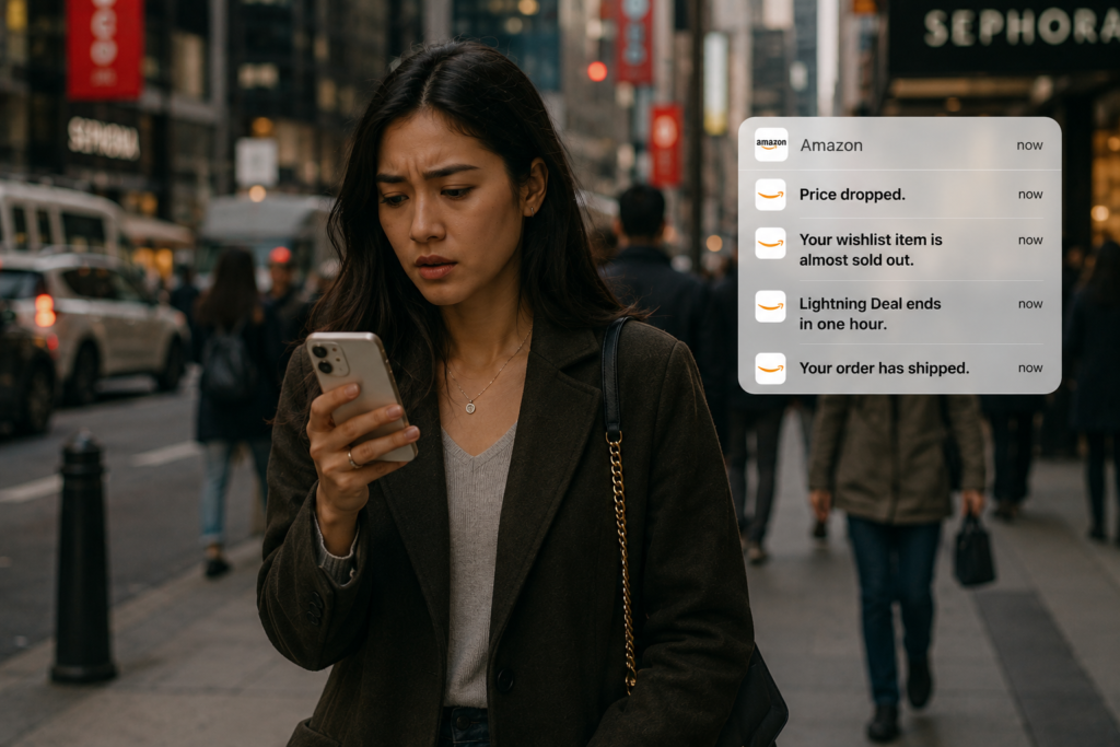
Shopping apps use notifications in several different ways.
You might see:
- Price dropped.
- Your wishlist item is almost sold out.
- Lightning Deal ends in one hour.
- Your order has shipped.
Each notification triggers a different emotion.
Some create excitement.
Others create urgency.
Some provide reassurance.
Together, they keep customers engaged and encourage them to return to the app regularly.
Although these notifications seem simple, they are carefully designed using psychology and marketing principles to influence customer behavior.
The Hidden Marketing Strategy Behind Notification Badges
At first glance, notification badges appear to be simple informational tools.
In reality, they are one of the most effective customer retention strategies ever created.
In business, acquiring a new customer is often far more expensive than keeping an existing one.
That is why successful companies invest heavily in customer retention.
A notification badge isn’t designed merely to inform you.
Its primary purpose is to encourage you to return.
Every time you notice that tiny red dot, the app receives another opportunity to reconnect with you.
It doesn’t interrupt you with an advertisement.
It doesn’t demand your attention.
Instead, it quietly reminds you that something is waiting.
That reminder is often enough.
This is why companies spend enormous resources improving their notification systems.
Every unread message.
Every comment.
Every order update.
Every connection request.
Every reminder.
Each one is another opportunity to bring users back into the app.
The more frequently users return, the stronger their habit becomes.
Over time, that habit often develops into loyalty.
The Attention Economy
Today’s businesses compete for something even more valuable than money.
They compete for your attention.
Think about your smartphone for a moment.
Within a single hour, you might receive notifications from:
- Gmail
- YouTube
- Amazon
- Swiggy
- Zomato
- Banking apps
Every one of these apps wants the same thing.
To be opened first.
Your attention has become one of the world’s most valuable resources.
Unlike money, attention is limited.
You only have so much of it each day.
Every company is competing for a share.
Notification badges help companies stand out in this crowded digital environment.
They quietly compete against every other icon on your home screen.
The app that captures your attention first often wins your time.
Marketing Lessons Businesses Can Learn
Notification badges aren’t useful only for technology companies.
The same psychological principles can be applied by almost any business.
Create Curiosity
People are naturally drawn toward unanswered questions.
Instead of revealing everything immediately, create curiosity.
For example:
- “Discover the secret behind successful restaurants.”
- “Most business owners make this common mistake.”
Curiosity encourages readers to continue.
Use Visual Contrast
Notice how online stores highlight important offers.
Bright buttons.
Sale banners.
Limited-time offers.
These design choices immediately attract attention because they stand out from everything else on the page.
The principle is exactly the same as the red notification badge.
Reduce Uncertainty
Customers appreciate updates that reduce uncertainty.
Examples include:
- Your order has been shipped.
- Your payment has been received.
- Your appointment has been confirmed.
- Your table has been reserved.
These notifications build trust and improve the overall customer experience.
Create Urgency Carefully
Urgency should encourage action—not pressure people unfairly.
Examples include:
- Only 3 items left in stock.
- Offer ends tonight.
- Registration closes tomorrow.
- Early bird discount ends soon.
Used honestly, urgency helps customers make timely decisions.
Build Long-Term Relationships
The biggest lesson behind notification badges is this:
Successful businesses don’t simply sell products.
They build ongoing relationships.
Small reminders.
Helpful updates.
Useful information.
Consistent communication.
These are what keep customers engaged over time.
Frequently Asked Questions (FAQs)
Why are notification badges usually red?
Red naturally attracts human attention because it is associated with urgency, importance, and action. It also creates strong visual contrast against most app icons.
Do notification badges really increase app engagement?
Yes.
Notification badges encourage users to reopen apps by creating curiosity and reminding them about unread messages, updates, or activities.
Which psychological principles make notification badges effective?
Notification badges combine several psychological concepts, including:
- Color Psychology
- Visual Salience
- Curiosity
- The Zeigarnik Effect
- Fear of Missing Out (FOMO)
- Uncertainty
Together, these principles make notification badges highly effective at attracting attention.
Why don’t companies use blue notification badges?
Blue represents calmness, trust, and stability.
While these qualities are excellent for branding, they don’t create the same sense of urgency or visual contrast that red provides.
Can too many notifications reduce engagement?
Absolutely.
Sending too many notifications can overwhelm users.
This is known as notification fatigue.
When users feel constantly interrupted, they may:
- Mute notifications
- Disable app permissions
- Ignore alerts
- Uninstall the application altogether
The most successful companies focus on sending notifications that are timely, relevant, and genuinely useful.
Final Thoughts
The next time you unlock your smartphone and notice that tiny red notification badge, pause for a moment.
You’re not simply looking at a colored circle.
You’re looking at decades of research in psychology, neuroscience, behavioral economics, marketing, and user experience design—all condensed into a tiny design element.
That little red dot doesn’t force you to tap.
It doesn’t shout for your attention.
It simply understands how the human mind works.
It uses curiosity to spark interest.
It uses contrast to stand out.
It uses color psychology to signal importance.
It uses the Zeigarnik Effect to create a feeling of incompleteness.
It uses uncertainty to encourage action.
Perhaps the most fascinating lesson isn’t about smartphones at all.
It’s about human behavior.
The smallest details often create the biggest impact.
Whether you’re designing an app, building a website, running a business, or writing content, understanding how people think is often more valuable than simply understanding technology.
The best marketing doesn’t interrupt people.
It doesn’t pressure them.
It doesn’t force them to act.
Instead, it quietly earns their attention.
And sometimes, all it takes is a tiny red dot.